
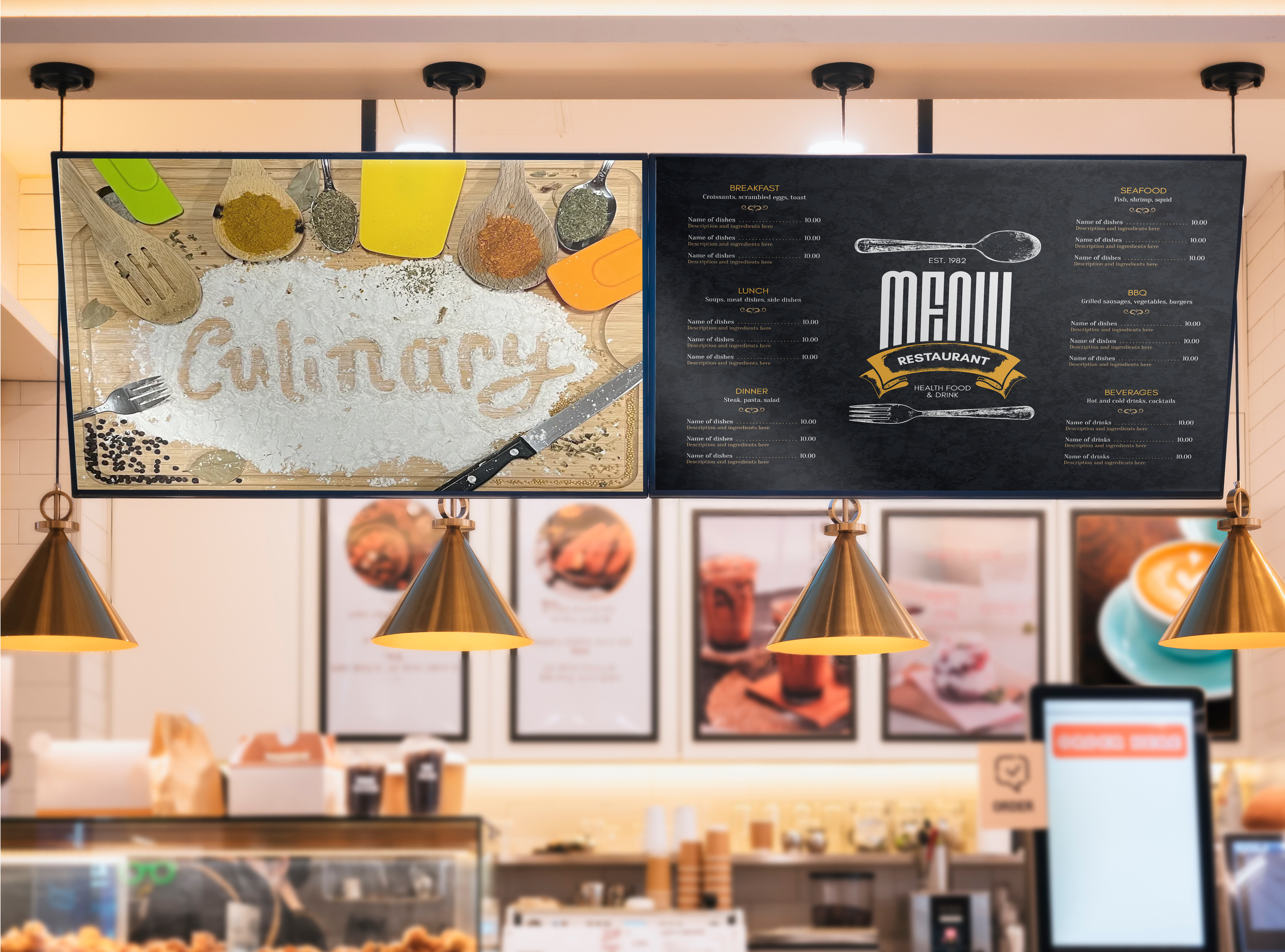
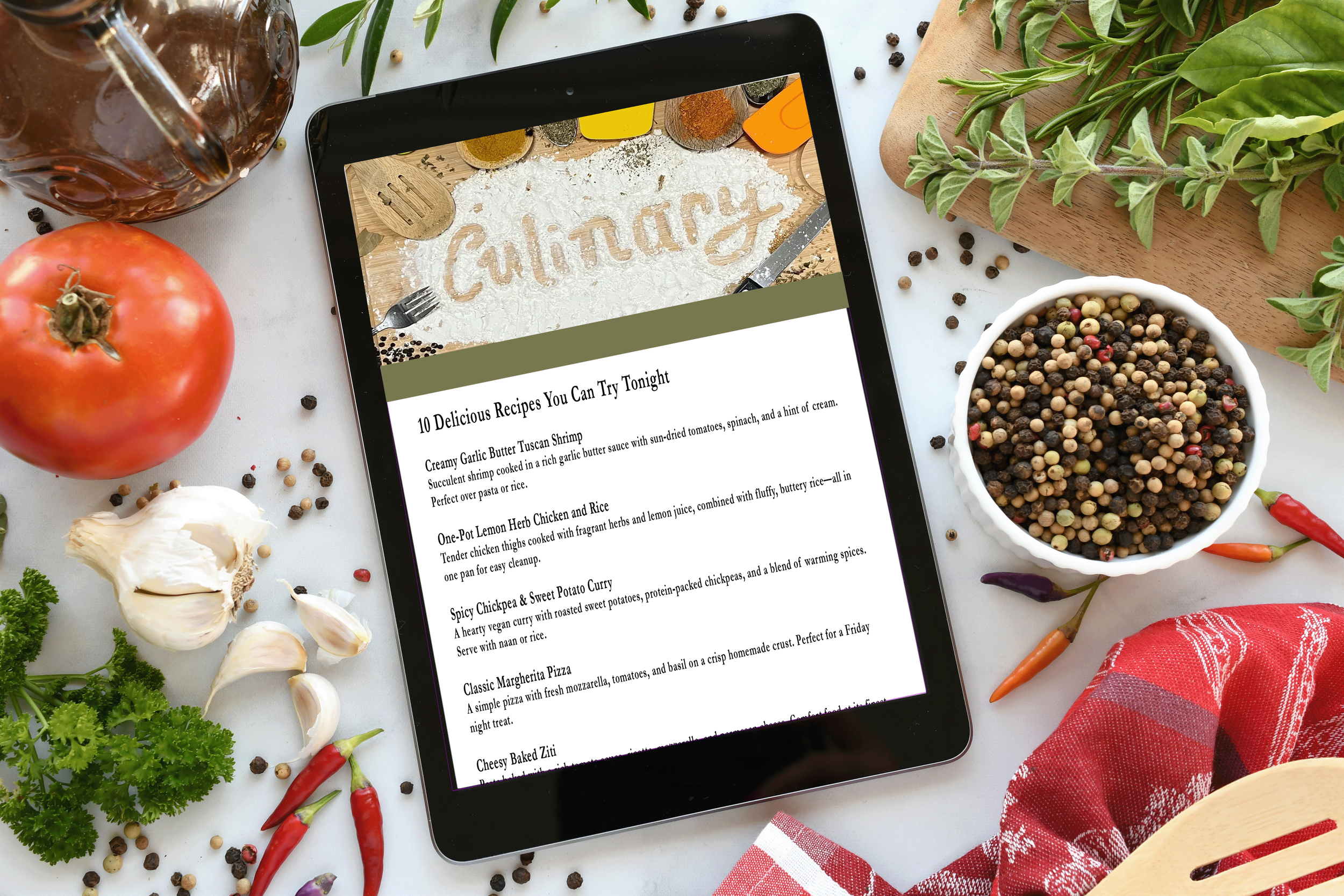
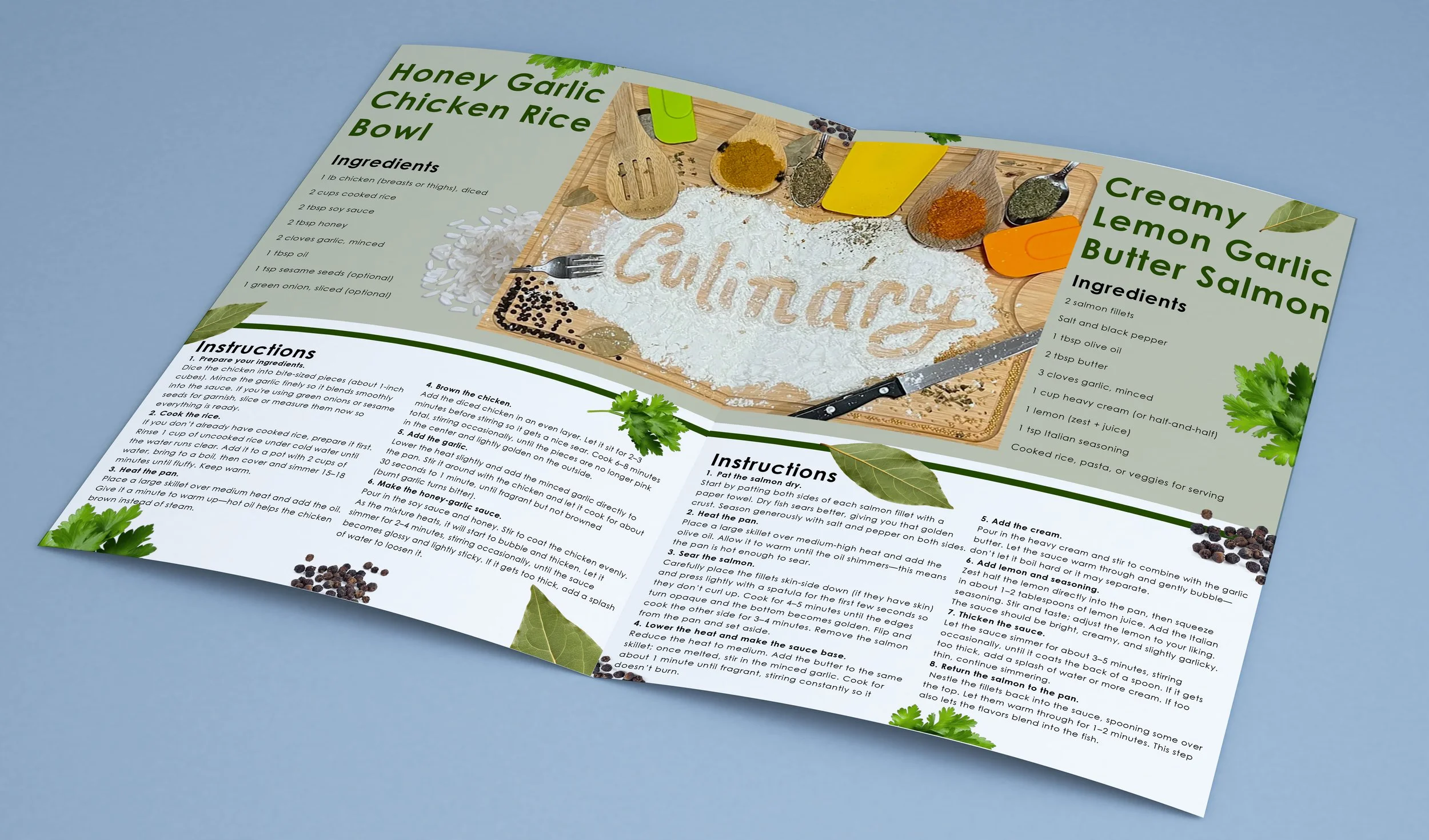
Typography Exploration
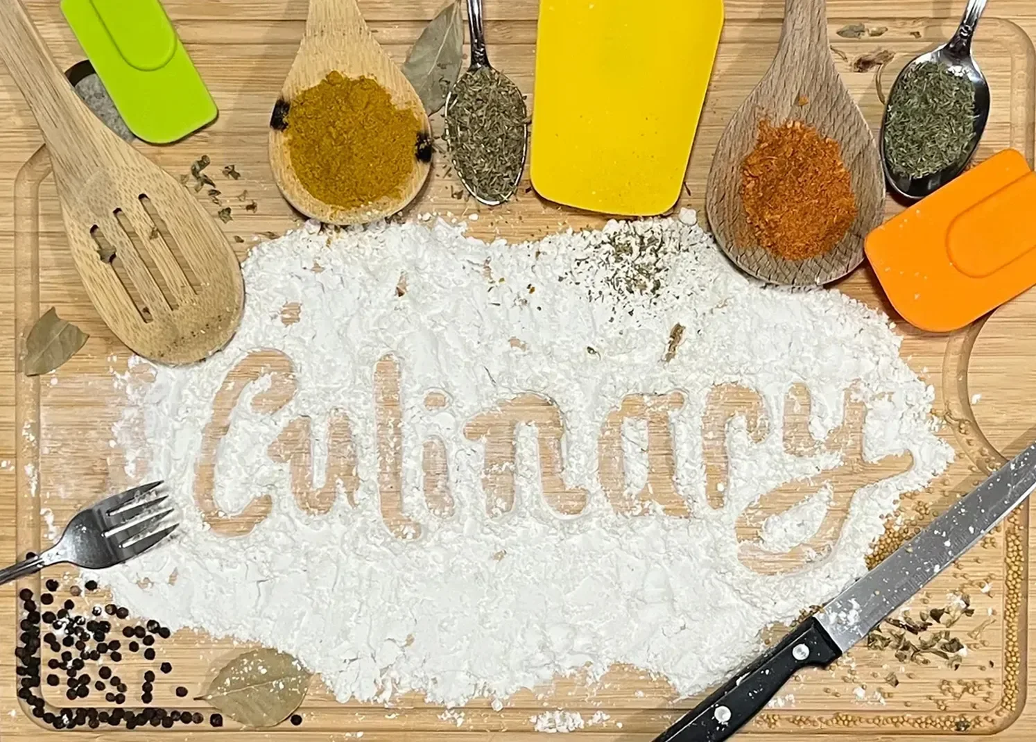
For this client project, I was fictionally commissioned by Wegmans to create a typographic artwork for an in-store display celebrating the art of cooking. I explored the word “Culinary” by spelling it out in flour, surrounding it with cooking utensils and spices as decorative elements. The flour formed the word itself, while the surrounding items reinforced the theme and added visual depth. This composition highlights the connection between concept and design, transforming everyday grocery ingredients into a playful, engaging visual centerpiece for a culinary-inspired environment.
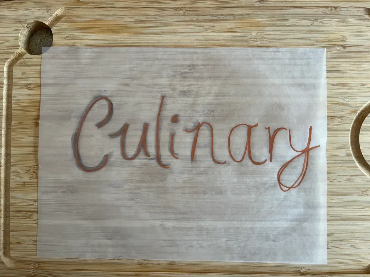
Experimented with various font styles to capture the character of the word Culinary.
Chose a typeface that embodied the desired tone and personality.
Created a handwritten typeface to visually express the concept’s meaning.
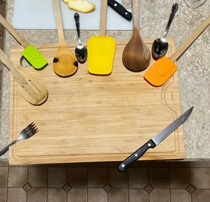
Designed supporting visuals to enhance the word’s identity and impact.
Refined layout, form, and detail to achieve a cohesive final composition.